Top Mistakes To Avoid While Working On A Web To Print
Web to Print refers to remote printing or online printing. It provides various services such as designing, editing, and personalizing effects before the item is printed. All of these services are provided online and are remote. A website or storefront is used as an interface. This helps interact with the potential customers in need of the service.
Though it is a lucrative option for those who wish to customize their products while being free from the hassle of traditional printing routes, one needs to be careful while picking a solution and choose a perfect match.
This is because implementation may at times become a challenge. Careful considerations are required before seamless solutions can be applied and the chances of mistakes are high. Such mistakes can not only spoil the customer experience but also list a negative review for the company providing the solution.
There are several mistakes which are prevalent in the industry and it is our job to inform you, the customer about them and help you avoid them. You may face lack of research, slow load times, poor checkout, lagging technology, absence of e-commerce experience and several such issues.
Down below, we have listed some of the commonest missteps one might encounter in a Web to Print business and what to look out for.
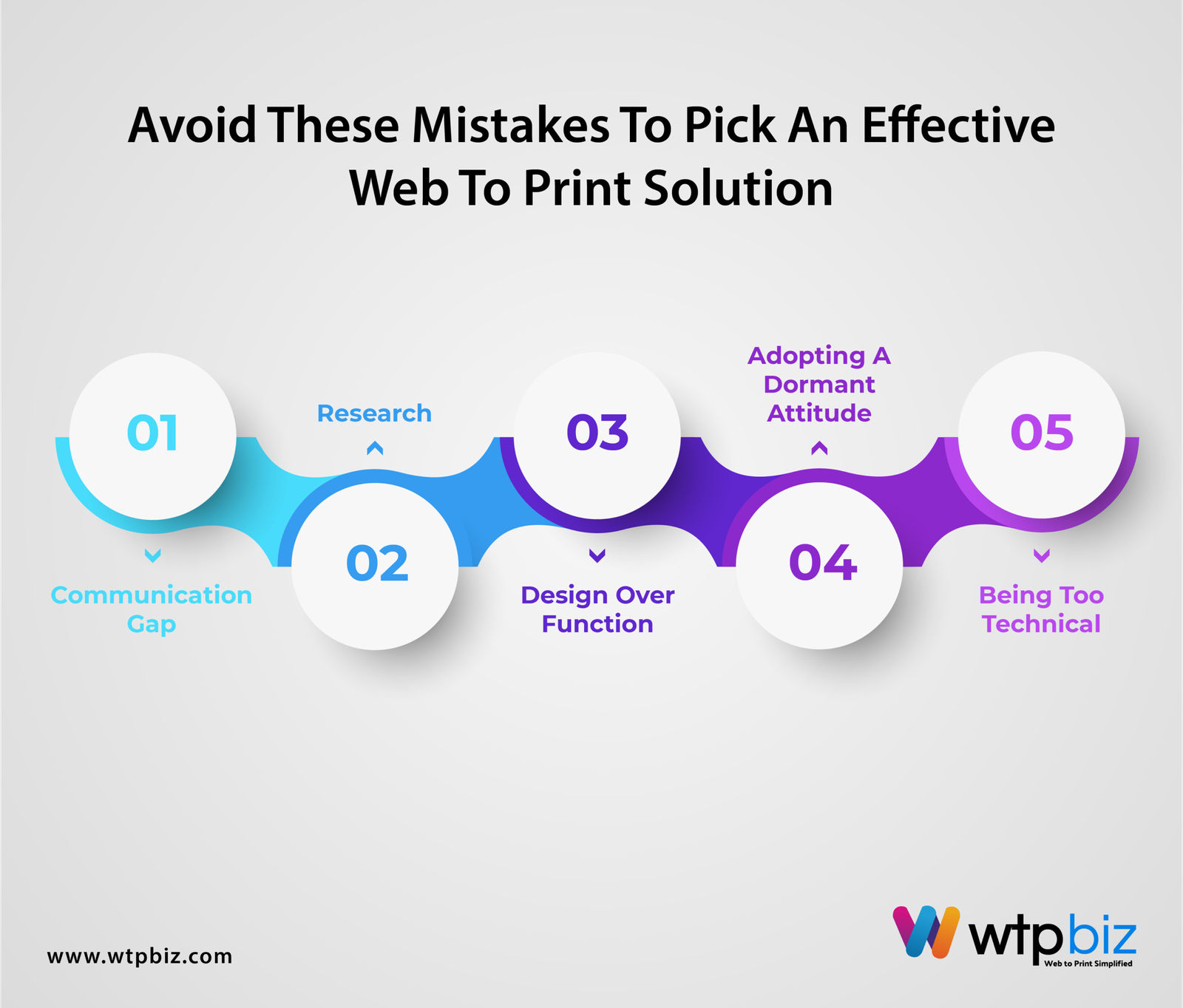
Always Look Out For And Avoid These Mistakes To Pick An Effective Web To Print Solution
 1. The Communication Gap
Good communication is the key to success for every business venture. An open communication channel between the web to print store and the customer is necessary. It ensures the augmentation of value and the building of a healthy relationship along with the delivery and understanding of the W2P solution requirement of the customer. A gap between the store and the intended audience leads to a lack of effective exchange of ideas. A lack of good communication presents a picture of incompetence at least and aloofness at worst. A web to print entrepreneur should be aware of the requirement for an effective communication channel and ensure open discussion. If such communication is not present and the client’s needs are not perfectly understood, you may need to rectify or need a do-over. It wastes precious time and resources.
What to avoid- stores which do not offer means of contact and effective communication
What to look for- services with a channel of healthy and immediate communication, both before and after the purchase of the product
2. Research
It is said that you should always go for what audience want. In a way is right and in a way it ain’t since without any prior research what audience want, and just assume which is a great mistake you could ever do. There’s no need to guess when you can assess available market offers and draw solid conclusions about what works best. For starters, Research your competitors’ designs prior to creating yours this will help you understand What type of colors, fonts, and design styles are popular within the niche, What type of products are available and what’s missing, How similar designs are priced and marketed.
For example if you want to sell gift cards for some special occasions. start by googling “custom gift card for special occasions”. See what’s available on marketplaces like flipkart, Amazon,and etc. Make a list of products that come up first and evaluate what makes them stand out. More importantly, think about how to make your designs better and unique than those already available in market.
3. Design Over Function
This is the era of aesthetics and everybody is looking for something which is visually appealing. To survive in such an age, having an artful style provides an edge but focusing on the design to such an extent that it compromises an optimum functioning is one of the greatest blunders a store can make. The concept of W2P was born from the idea of providing a smooth and trouble-free experience. To complicate such an experience by compromising on the functions is a sure-shot way of losing customers. An effective website will always have a simple yet attractive user friendly interface.
What to avoid- a storefronts with too many complicated designs
What to look for- A balance between design and effective functioning
4. Adopting A Dormant Attitude
Some people believe that setting up is a one-time investment and they only need to tweak the system and fix the apparent issues after that. Nothing can be further from the truth. Adopting such a dormant attitude might be the reason for the failure of your web-to-print store. Technology is constantly evolving with new updates in software, design tools, and market trends. One needs to remain vigilant and actively keep up will all the latest updates to keep his web-to-print store up to the date and provide his customers with the best possible experience. Adopting the latest updates, looking out for new resources, and using them early on will add to customer satisfaction. It will boost the affectability of the product. It will also provide customer loyalty in the long run. Being constantly active will keep you updated with the industry standards as well as keep you connected with the customer.
What to avoid- entrepreneurs who are not proactive and services that do not offer the latest updates available in the market.
What to look for- stores with all the latest updates and new resources
5. Being Too Technical
The web-to-print software and the print tools have a user-friendly interface to ensure optimum productivity. While explaining a W2P solution to a client, using too many technical terms makes it sound strenuous and grueling. The job of is to simplify the process for the client rather than exhaust them by burdening them with unnecessary knowledge about the technical aspects of the tools. The focus should be on emphasizing the benefits of web print rather than discussing the technology behind it. Using technical terms will only confuse the client as many would not be familiar with these. The representative of the company who guides you through the process should make the procedure as easy to understand as possible. This way, you will have enough information about the Web print without feeling overwhelmed with the technicalities.
What to avoid- representation which is difficult to understand
What to for stores- that explain the process in simple, non-technical terms.
To Wrap Up
To make the most of your web-to-print experience, remain on the lookout for the red flags of the W2P industry ie. those mentioned above. Avoid falling into the trap of bogus websites and to ensure a simpler and more satisfactory experience. Successfully avoiding these mistakes will help you find customers for a long time while providing them with an experience they will appreciate. Contact our team and get onboard with your software journey.
 1. The Communication Gap